All work
C
Cargolane · B2B · Design system
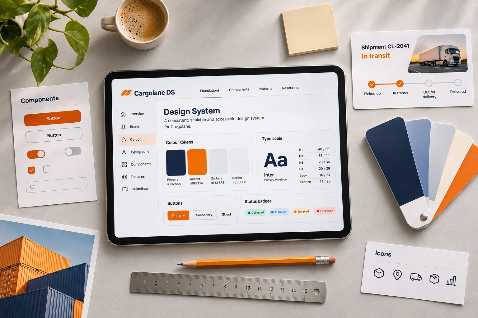
One design system for four logistics products
Cargolane makes software for freight forwarders: booking, tracking, warehouse and billing tools used by 1,200 logistics companies.
My role
Design system lead, design and front-end
Team
1 designer, 2 front-end engineers, 4 product teams
Timeline
16 weeks · 2024
Platform
Web, tablet and a Vue library
Overview
Four products that finally feel like one
01
The challenge
Four products had been built by four teams over six years. Buttons, tables and status colours were different everywhere.
02
The goal
Create one set of tokens and components all four products could adopt without stopping feature work.
03
My role
I ran the UI audit, designed the tokens and core components, and built the Vue library and its documentation with two engineers.
01 · The problem
Four products and 47 kinds of button
Customers used several Cargolane products every day and kept relearning them. The same shipment status was green in one product and blue in another.
Every team rebuilt the same components, so fixes and accessibility improvements never reached the other products.
47
button styles across four products
11
colours used for shipment status
4
teams rebuilding the same table
02 · Research
Auditing every screen across four products
I collected every component in production, grouped them on one board and marked duplicates, conflicts and accessibility failures.
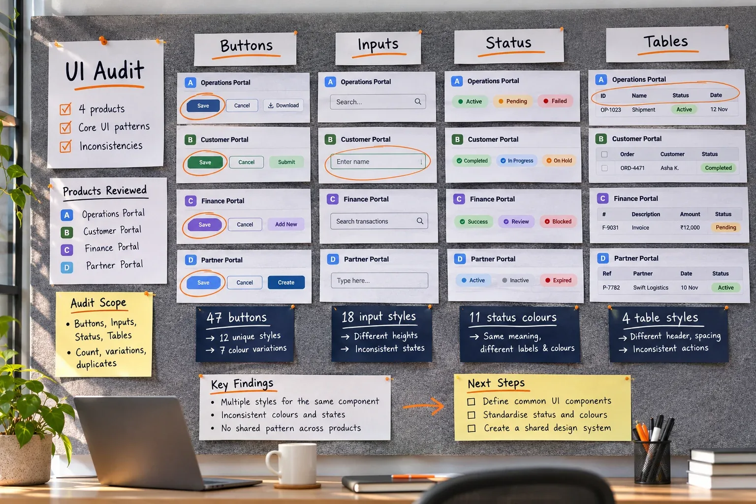
Part of the audit board: every button, input and table found in production.
What we learned
Insight 01
Status is the product
Shipment status appears on every screen, so it needed one meaning and one colour.
Insight 02
Tables do the heavy lifting
Most work happens in dense tables, so the table component came first.
Insight 03
Adoption beats perfection
Teams adopted components they could drop in one at a time.
03 · The solution
Tokens first, then the components everyone needs
A small token set, twenty-four core components and a documentation site, released one component at a time so teams could adopt them without a rewrite.
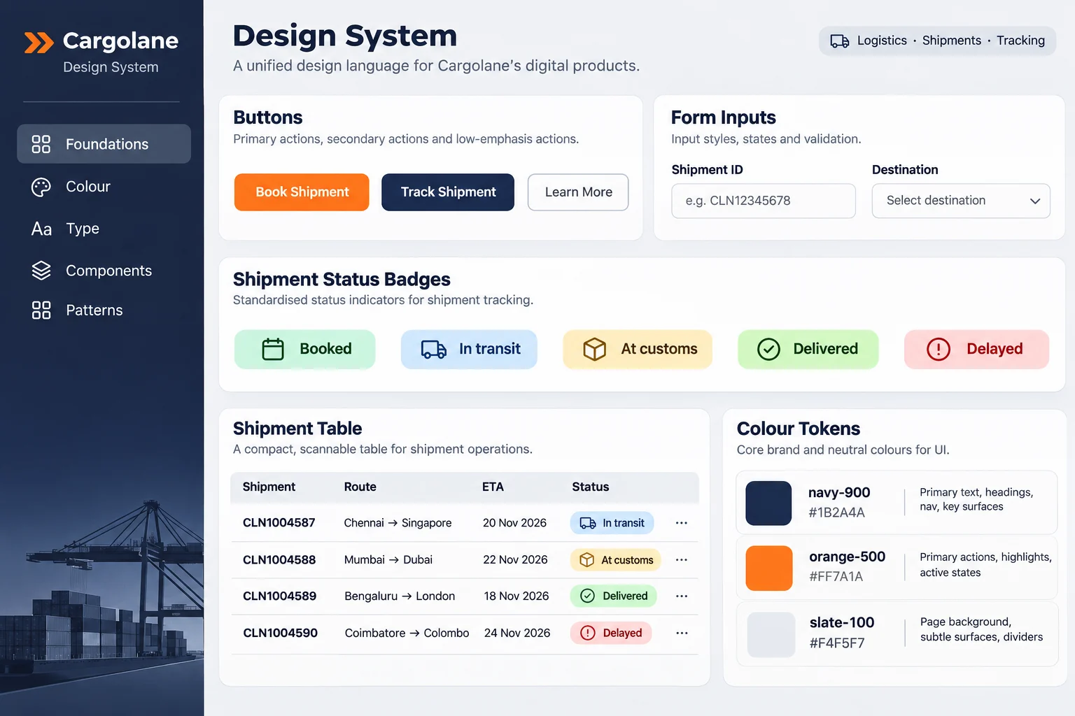
Twenty-four components, documented in one place
Every component comes with usage notes, accessibility checks and live Vue examples.
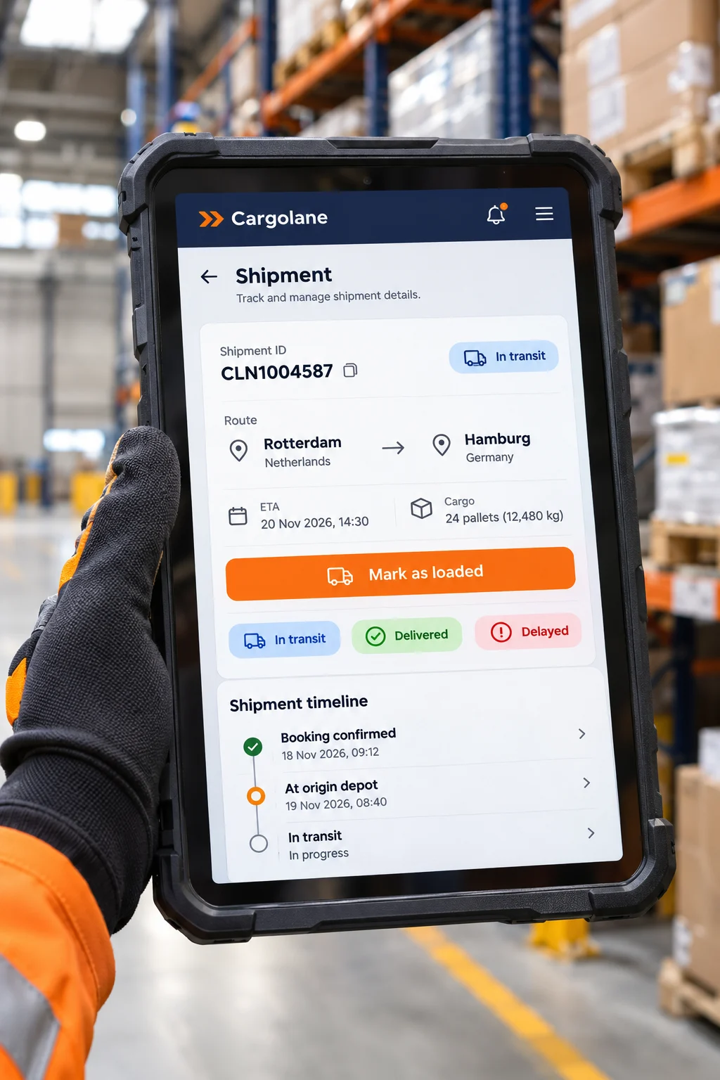
Built for the warehouse floor
Large touch targets and high-contrast status badges work on rugged tablets, even with gloves on.
Key decisions
Three decisions that shaped the design
01
One status palette
Five shipment statuses, each with one colour, icon and label everywhere.
02
Dense by default
Tables and forms stay compact on desktop and grow for touch.
03
Ship in slices
Each component was released on its own, with a script to replace the old one.
04 · Results
Six months after the first release
4
products running on one design system
47 → 3
button styles in production
−30%
front-end time per new feature
Figures are sample content for this template.
“Our four products finally look and behave like one platform. Iris set up a system our teams actually wanted to use, and it pays off with every release.”
D
Daniel Okoro
VP of product, Cargolane
05 · What I learned
What I would keep for the next project
Audit before you design
The audit board convinced every team faster than any presentation.
Make adoption easy
Drop-in components and migration scripts mattered more than a perfect API.
Write down the why
Recording why each rule exists stopped the same debates from coming back.
Next case study
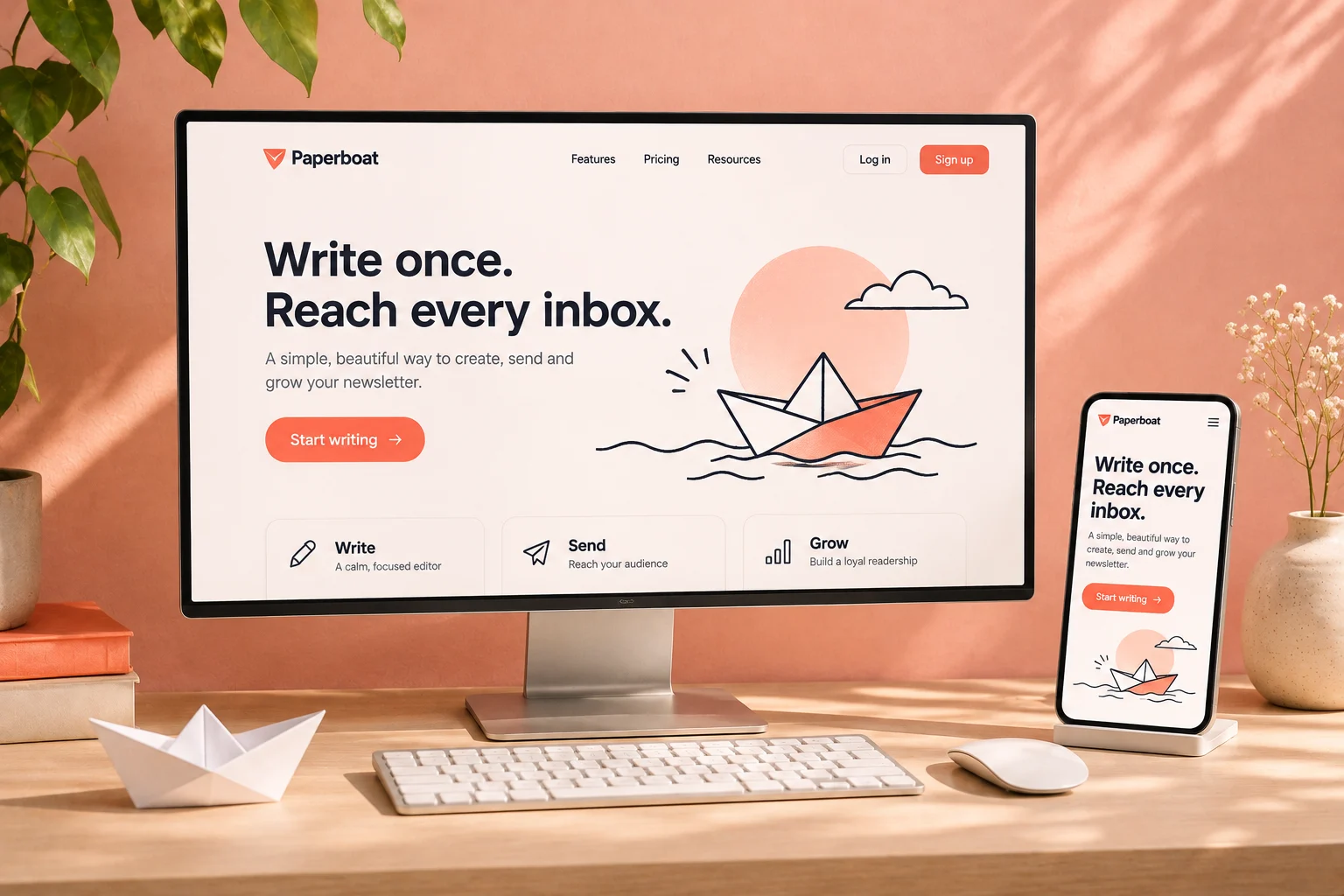
Marketing site and docs for a newsletter platform
Paperboat · SaaS · Website
Next opening · January 2027
Let's build the next one.
Tell me what you're building and when it needs to be live. I take on one build at a time, so I'll be straight with you about timing and fit.

Iris Vane
Usually replies the same day
Reply within one working day
30-minute intro call
Proposal and fixed price in three days
Nothing is payable until you sign.
© 2026 Iris Vane. Projects, clients and figures are sample content.
Back to top ↑