Mara Okoye
Booking projects from February 2027
I'm a Lisbon-based designer making identities and packaging for food, drink and culture brands: sharp systems that still feel made by hand.
01
Index
Portfolio 2019 — 2026
02
Work · Case study
Fenna Bakehouse, 2025
03
Studio
About, approach and path
04
Services
Three ways to work together
05
Contact
Start a project
Lisbon, Portugal · Working worldwide
All work
Case study · Identity and packaging · 2025
Fenna Bakehouse
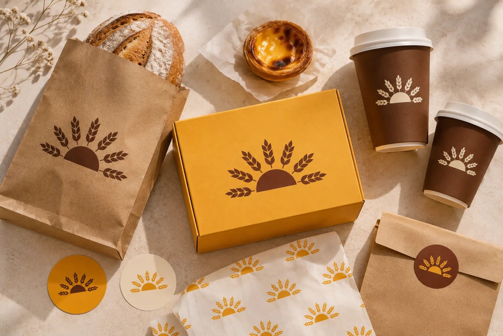
A neighbourhood bakery in Lisbon's Campo de Ourique wanted packaging customers would keep. We built everything from a single wheat-sun symbol and three warm colours.
Client
Neighbourhood bakery and café, Lisbon
Role
Identity, packaging, signage and print production
Timeline
Ten weeks, spring 2025
Team
Mara Okoye with a copywriter and a local printer
The brief
Great bread, forgettable bags
Fenna had a queue every morning but used plain stock packaging and a logo made in a hurry. With a second shop opening, the founders needed a brand that staff could apply without a designer and that customers would recognise across the street.
The idea
Bread rises with the sun
The bakers start at four, before sunrise. A half sun made of wheat ears became the symbol: simple enough to stamp, emboss or print in one colour, and warm enough to carry the whole brand on its own.
The system
Three parts, endless combinations
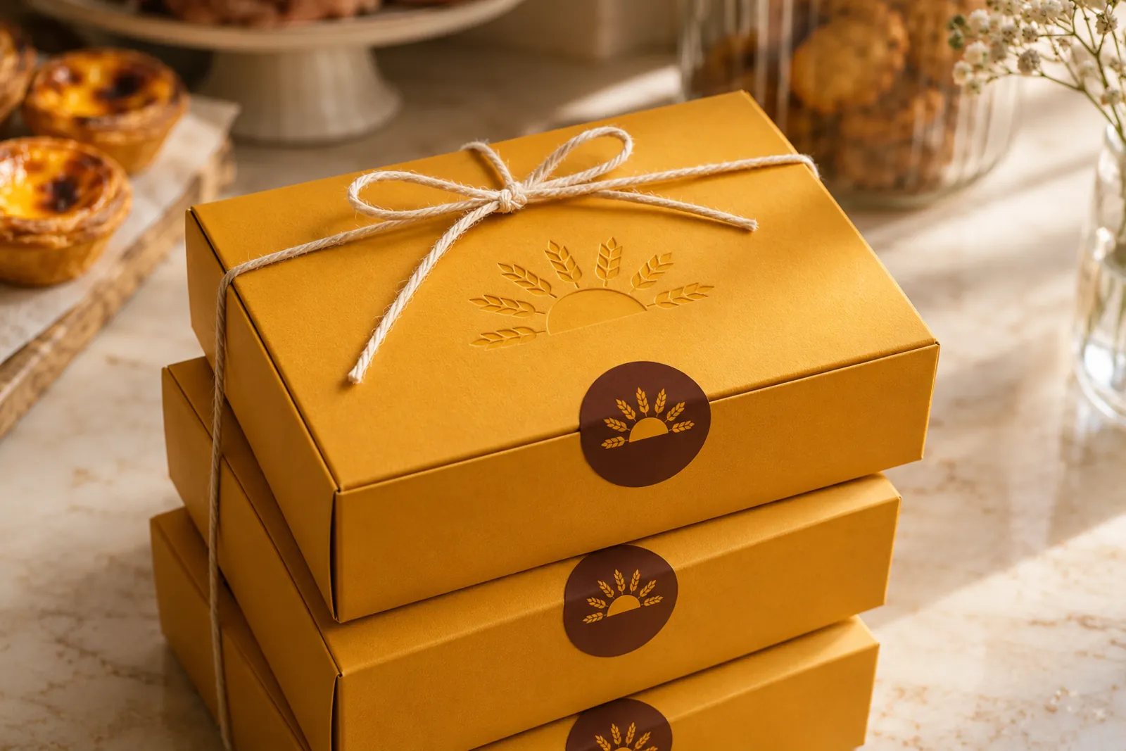
Symbol
Drawn to work as a stamp, an emboss and a sticker. It reads at 12 millimetres and on a four-metre fascia.
Mustard
#E8A317
Cocoa
#4A2A1A
Flour
#F4EDE1
Colour
Crust, crumb and coffee. Three colours that print well on kraft, so most items need only one or two inks.
Aa
Bread · Pão · Pastelaria
Type
A clean grotesque for menus and labels, paired with hand-drawn lettering for the name and seasonal specials.
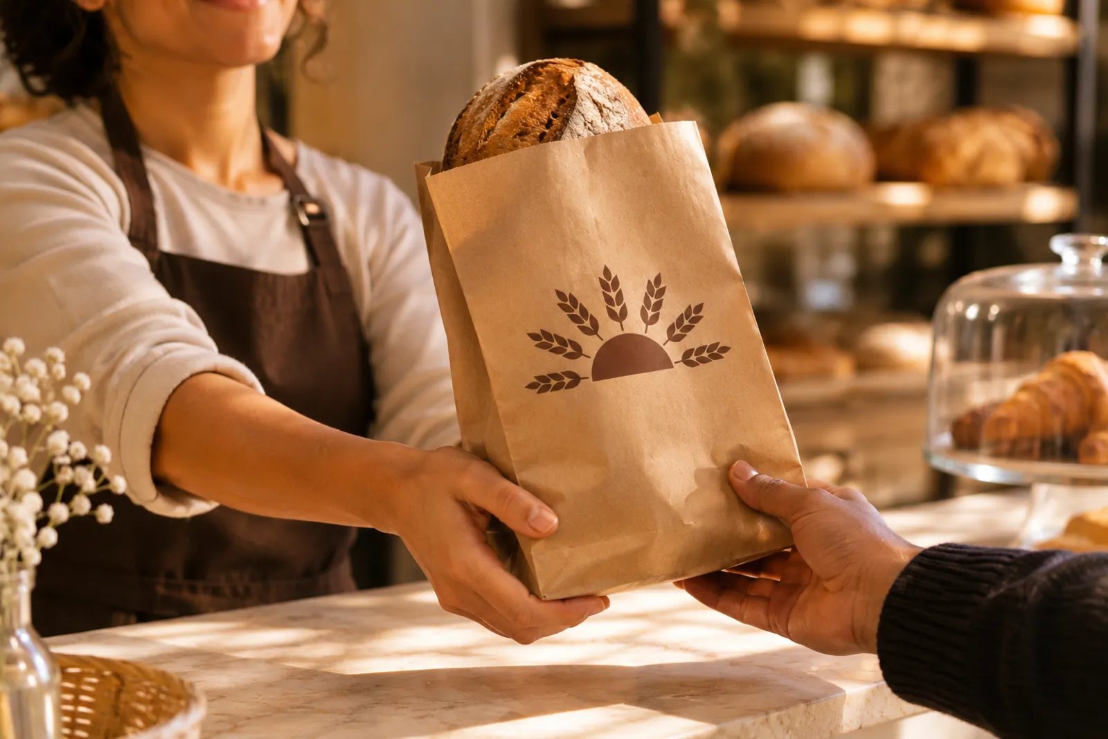
Bags, boxes, cups and stickers share one symbol, so a single stamp covers short runs and seasonal specials.
Outcome
Ready for the second shop on day one
The team now orders packaging from a one-page guide, and the new shop opened with signage, menus and bags already in place.
11
packaging items from one symbol
2
inks at most on any printed piece
10
weeks from first workshop to shelves
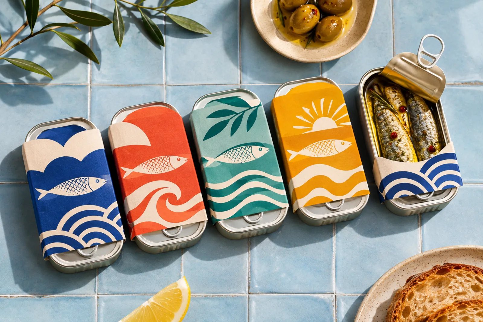
Identity, packaging and lettering from a small studio in Lisbon.
Menu
© 2026 Mara Okoye. Projects, clients and quotes are sample content.
Back to top ↑